Manchester United 2026/27: The Salford Lads Third, the 1977 Cap-Tip, and the Royal-Blue Away That Earned an A
There's a strip at Old Trafford that most fans only pull out once a season — when the fixture doesn't need red, when the city is already doing the talking, when the shirt has to be a sentence instead of a logo. The third kit. For 2026/27 adidas didn't make a third kit. They made a letter to Manchester — written in maroon and green, sketched across ivory, sealed at the door of Salford Lads and Girls Club. The film of the launch was shot inside that club; the players who wore it sat on its steps. The shirt itself is the city, drawn at life-size.
But this collection is bigger than one love letter. The home shirt tips its cap to 1977 — the year the FA Cup final stopped being a Manchester argument and started being a Manchester inheritance — and brings back a polo collar that nobody under forty has ever worn to a match, but everyone over forty has missed. The away is bold royal blue, given an A by the kit writers who grade European strips, and a discreet nod to the engineered stripe work that made United's blue away kits famous in the first place. Three shirts, one identity, one city. Here is how to wear all of it without looking like you just walked out of the club shop with a bag.
1. The Home Shirt That Tips Its Cap to 1977
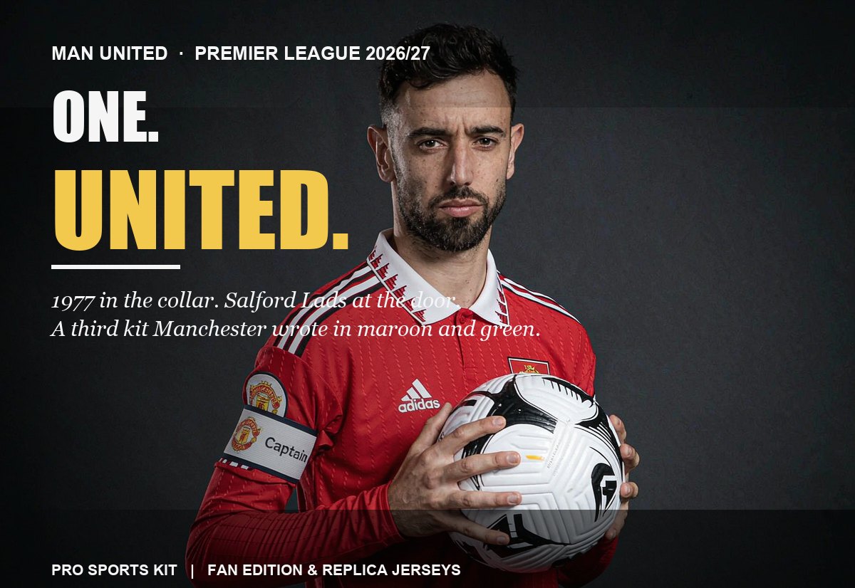
The adidas home shirt for 2026/27 was released on May 14, 2026 — three months before a ball was kicked — because Manchester United wanted the year of the 50th anniversary of the 1977 FA Cup final to start wearing it before the season even opened. The reference is unmistakable but gentle: a clean, vivid red base; the return of the polo collar for the first time in several seasons; striped sleeve cuffs that echo the kits of the 1970s; white adidas three stripes and adidas branding standing sharply against the red; black accents threaded through the body to preserve the traditional United colour balance. On the back of the neck, a quiet "United" sign-off — a small typographic note that this is a strip with a memory, not a strip with a marketing meeting behind it.
| Manufacturer | adidas (2nd season since the 2025/26 return, long-term technical partnership) |
|---|---|
| Released | May 14, 2026 |
| Primary reference | 1977 FA Cup final strip (50th anniversary of the triumph) |
| Collar | Classic polo collar, the first in several United seasons |
| Cuff detail | Striped sleeve cuffs, echoing 1970s United kits |
| Three stripes | White against the red body, sharp contrast |
| Accent | Subtle black integrated into the body to keep the traditional palette |
| Back-neck sign-off | "United" wordmark, a heritage-anchor on a modern shirt |
The honest read: this is a safe shirt in the best possible sense. It doesn't try to be futuristic, doesn't try to be controversial, doesn't try to convince you that United are still the team from the previous decade. It looks like a Manchester United home shirt should look. After a few divisive home templates, that simplicity is the actual flex. The polo collar in particular is the move — it gives the shirt a period feel without going full retro reissue, and it means the jersey looks just as correct worn with jeans on a tram as it does inside Old Trafford on a Tuesday night in the Carabao Cup.
The replica is cut for everyday comfort, breathable, built for the stand and the street. The player's on-field version is built for the pitch — heat-bonded seams, lighter fabric, the cut matchers prefer. Both carry the same heritage language; one is built for the tram, the other for the touchline.
2. The Third Kit: Salford Lads, Red Bricks, and the Door That's Always Green
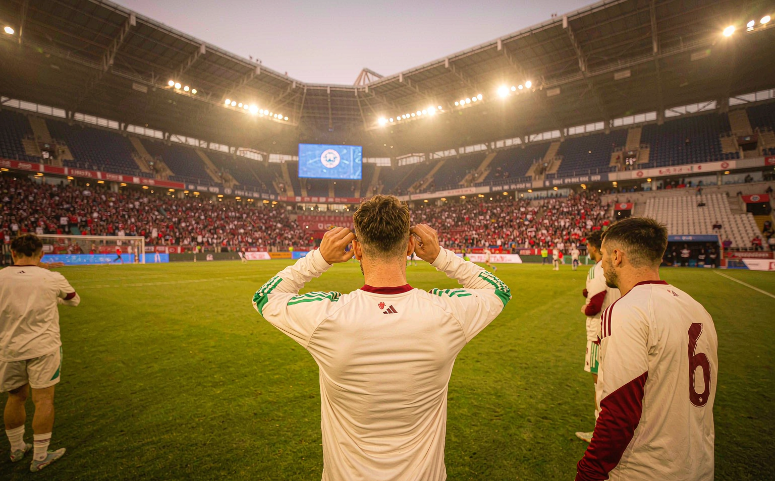
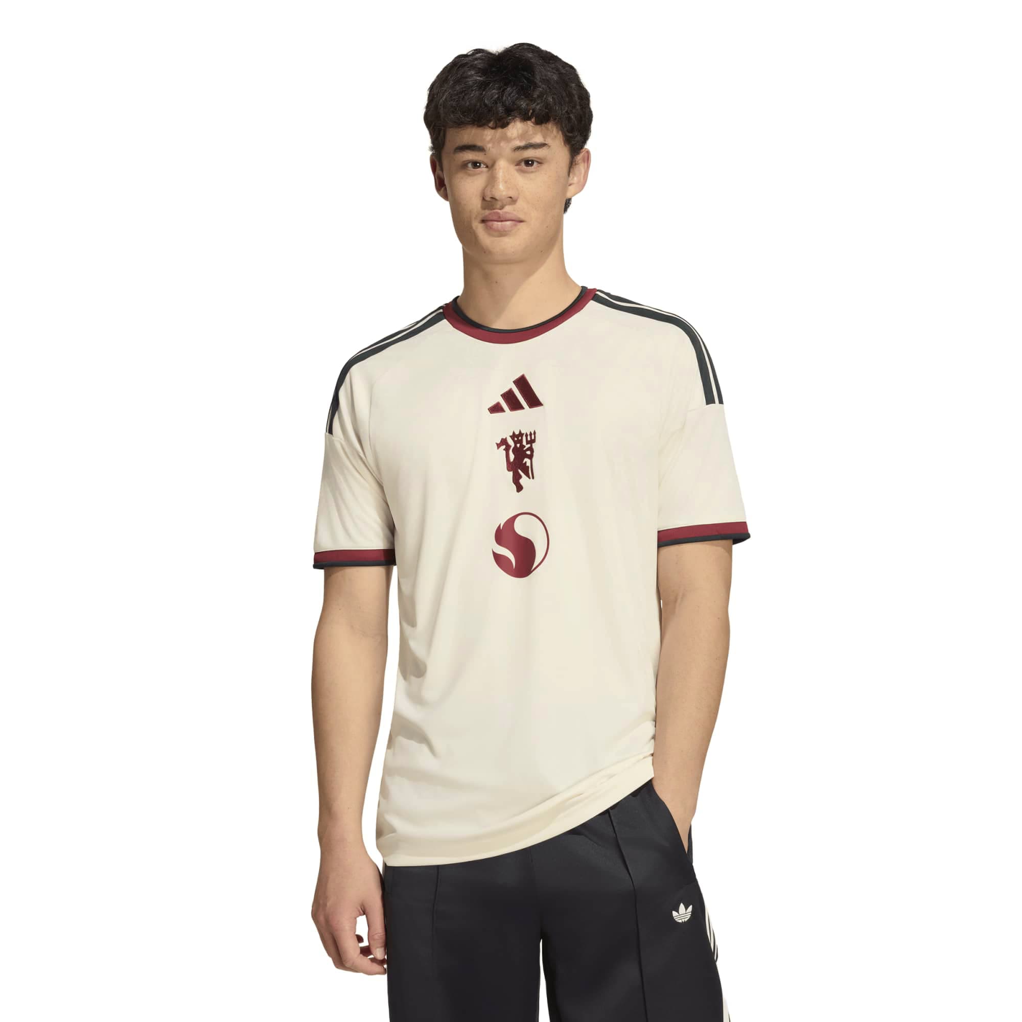
This is the centrepiece. The 2026/27 third kit is ivory, not white — a warmer off-white that lets the shirt read as a piece of clothing instead of a piece of marketing. Onto that ivory base, adidas has engineered a bespoke floral graphic across the fabric: hand-drawn rose illustrations, inspired by artwork found in community spaces and cultural institutions across Greater Manchester, including the Salford Lads and Girls Club where the launch video was filmed. The pattern sits on the shirt the way wallpaper sits on a Victorian hallway — present, legible, never loud.
Rich maroon detailing anchors the kit: the adidas Performance logo, the devil crest, the crew-neck collar, and the sleeve trims are all done in maroon that draws directly from the red-brick architecture of Manchester's historic buildings. Contrasting green accents run along the three stripes on each shoulder, a direct reference to the distinctive green doors found throughout the city — including the door of Salford Lads and Girls Club. The back neck carries a bespoke "Manchester United Football Club" sign-off that reinforces the heritage of the crest without repeating the badge on the chest. The kit is completed with dark shorts and ivory socks that carry elements of the jersey graphic, so the full strip reads as a single composition rather than three separate garments.
The launch film featured first-team players, club legends Gary Pallister and Peter Schmeichel, and Manchester locals Aitch and Angry Ginge, all filmed at Salford Lads and Girls Club. The campaign strapline — "A million reasons, one United" — sits underneath the imagery as a quiet thesis: the city is the club, the club is the city, and the shirt is the receipt. On-pitch it debuted in the final pre-season friendly against AC Milan in Wrocław, with the Premier League debut following at Hull City on August 22. By the time most fans had unboxed it, the shirt had already earned its own story.
| Manufacturer | adidas (third strip of the 2026/27 cycle) |
|---|---|
| Base colour | Ivory / off-white, warmer than optical white |
| Graphic | Bespoke hand-drawn Lancashire rose pattern, engineered into the fabric |
| Maroon detailing | adidas logo, devil crest, collar and sleeve trims — a direct reference to Manchester's red-brick architecture |
| Green accents | Three stripes on each shoulder — a direct reference to the green doors of Salford Lads and Girls Club |
| Collar | Streamlined crew-neck, contemporary silhouette |
| Back-neck sign-off | "Manchester United Football Club" bespoke embroidery |
| Performance tech | adidas CLIMACOOL+ body-mapped 3D engineered fabric, strategic zones for airflow |
| Full kit | Dark shorts with matching maroon and green detailing, ivory socks |
| Cultural anchors | Salford Lads and Girls Club (launch venue, community hub); red-brick architecture (maroon); green doors (three stripes) |
The honest read: this is the third kit you wear when you want the shirt to do the talking and you want to be the person who picked the right one. The colour grading is good enough that you can pair it with jeans, chinos, or a dark wool overcoat in autumn and still look composed. The fabric is heavier than the home replica by a touch — that's the engineered graphic, not a quality issue — so size accordingly if you're between sizes.
3. Royal Blue, Engineered Stripes, and Why United's Away Got an A
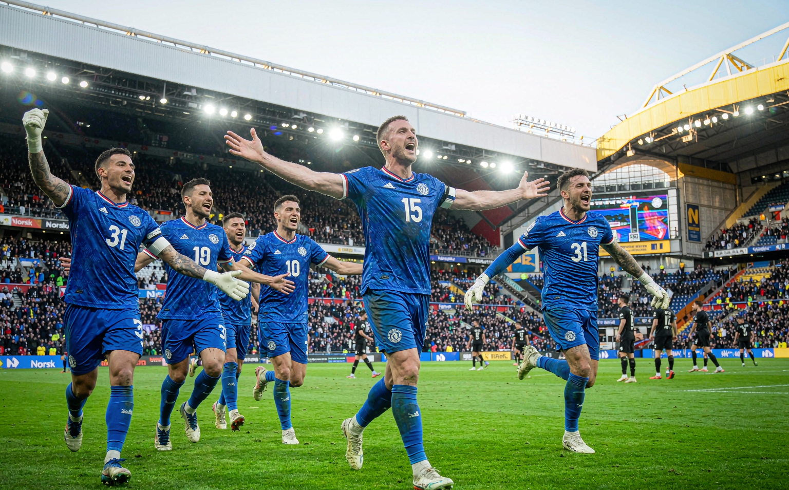
The away shirt is the one the kit writers graded an A — the only away shirt in the 2026/27 European cycle to earn the top mark, in the colourwaysports league-wide ranking. It's a bold royal blue base, paired with a V-neck collar and sleeve cuffs that pick up red and white detailing for a sharp contrast against the deep blue. Across the body of the shirt, an engineered tonal stripe graphic runs from shoulder to hem — visible up close, almost invisible at match distance, referencing the historic blue away kits that have defined United's identity on the road for decades.
The honest footnote: the design is excellent, but a number of owners have reported fabric pulls and snagged threads after light wear. The durability complaints are widespread enough across early buyers to be worth knowing before you commit. If you're buying to wear weekly, treat it gently. If you're buying for matchday and the stand, you'll be fine. It is, by the assessment of the kit writers who grade Europe's strips every season, the best away shirt of 2026/27 — and you can see why the moment you hold it up to the light. The blue is that blue. The pop of red at the collar is the detail that makes the whole thing.
Shop the Full Manchester United 2026/27 Edit
Six pieces, all current-season, all 26/27. Two home replicas (with and without a player name on the back), the away, the third, and the two on-field versions for fans who want the players' cut. Every image below was HEAD-verified and pulled straight from the catalogue — no rendered placeholders.




Keep Reading
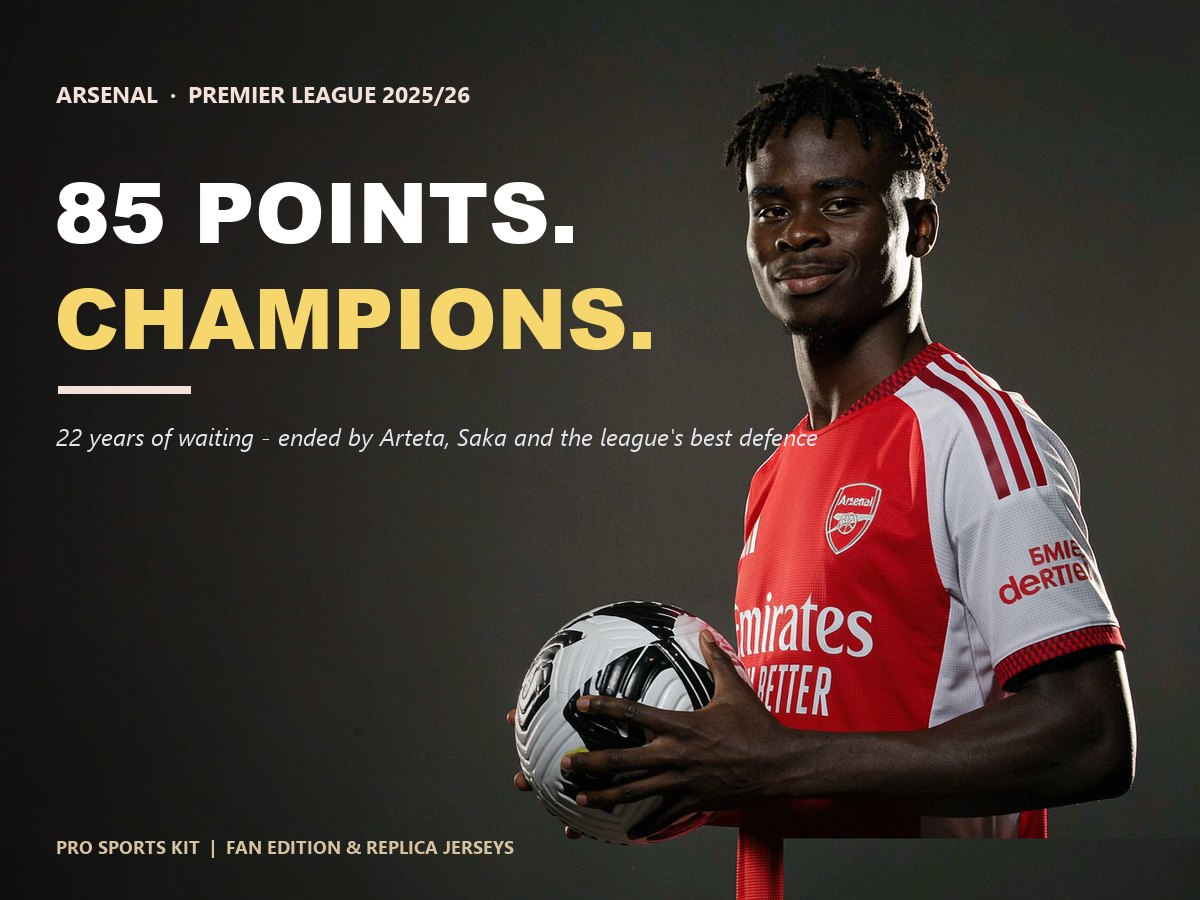
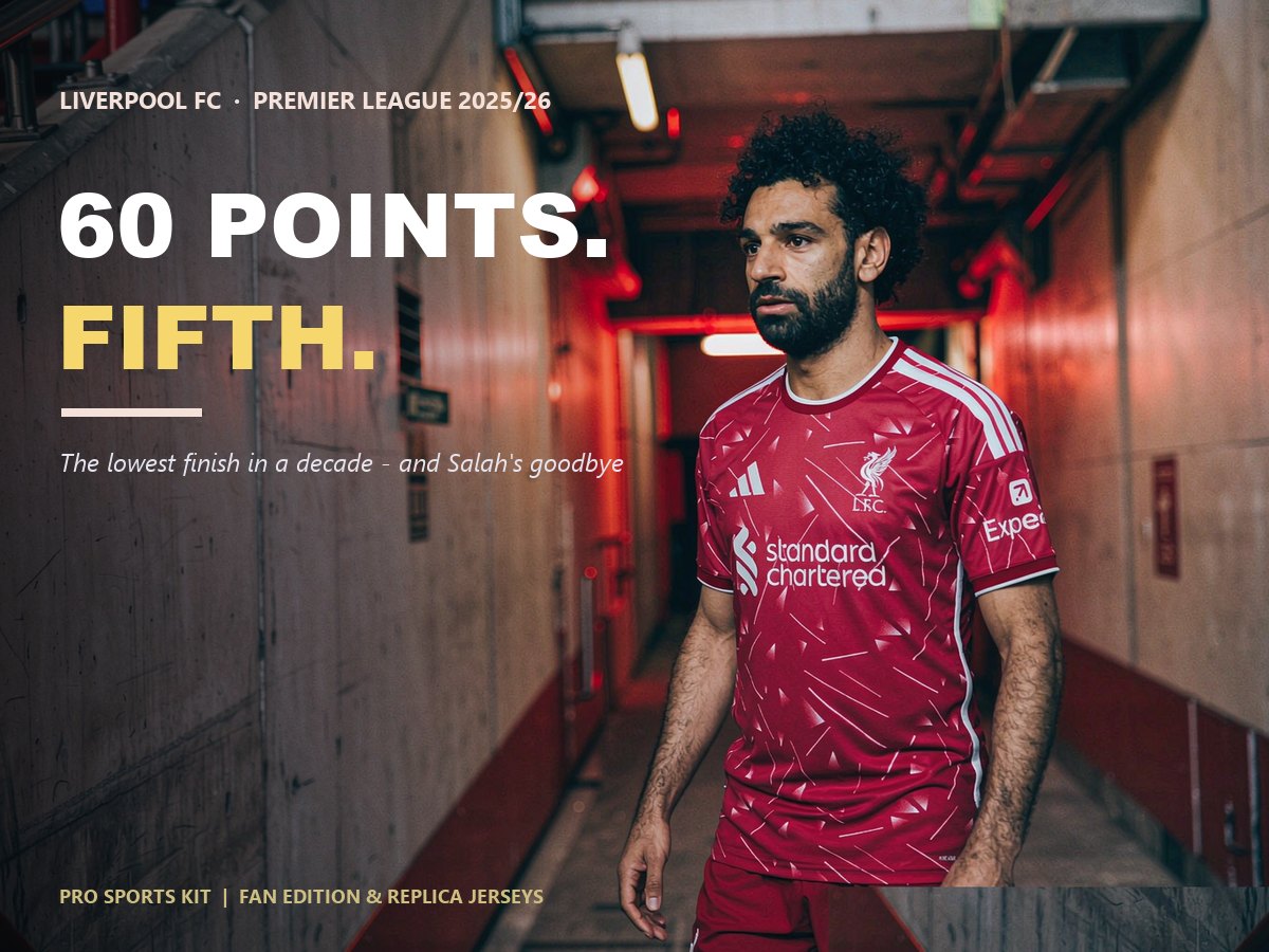
Three hubs to extend the wardrobe across the rest of the English top flight and into the European competitions. Each one was written for the same jersey-shopper and the same fan — pick the one your weekend needs.
Manchester United 2026/27 FAQ
When were the Manchester United 2026/27 kits released?
The home shirt was released on May 14, 2026 — three months ahead of the new season — to mark the start of the 50th anniversary year of the 1977 FA Cup final. The away and third kits were released later in summer 2026, with the third kit debuting on-pitch in the final pre-season friendly against AC Milan in Wrocław, and then in competitive Premier League action at Hull City on August 22.
Who makes the Manchester United 2026/27 kits?
adidas, on a long-term technical partnership that returned United to adidas for the 2025/26 season after a previous spell under Nike. 2026/27 is the second adidas cycle, which is why the home and away carry a more settled, less experimental feel than a typical first-year launch.
What is the inspiration behind the 2026/27 third kit?
The third kit is a love letter to Greater Manchester, anchored by three references: Salford Lads and Girls Club (the launch venue, the green-door detail in the three stripes), Manchester's red-brick architecture (the maroon detailing on logo, crest, collar and cuffs), and the hand-drawn Lancashire rose (the bespoke floral graphic woven across the fabric).
What does the home shirt reference?
The home shirt salutes the 1977 FA Cup final strip on its 50th anniversary. The references are quiet: the return of the polo collar, striped sleeve cuffs that echo 1970s United kits, white three stripes against a vivid red base, subtle black accents, and a "United" wordmark on the back of the neck. It's a heritage-anchored shirt, not a retro reissue.
What's the difference between the Replica and the On-Field versions?
The Replica is built for everyday wear and the stand: breathable, slightly roomier, more comfortable across a full match and a long day after. The On-Field is the players' cut: heat-bonded seams, lighter fabric, body-mapped 3D engineered fabric with CLIMACOOL+ moisture management, and a slimmer fit. If you're buying for casual wear or a season-ticket seat, the Replica is the right call; if you're buying for the touchline or want the most real matchday feel, go On-Field.
Are these real match-issued kits?
These are Fan Edition and Replica jerseys — fanwear built for everyday wear and matchday support. They are not the players' match-issued kit. For the players' match-issued version, choose the On-Field cut (the higher-priced option in the same colour). For the supporter cut, choose the Replica. Both carry the same heritage design language; only the fabric, fit, and seam construction differ.
— Ace, writing from the Pro Sports Kit desk. We sell jerseys. We tell the story behind the shirt.